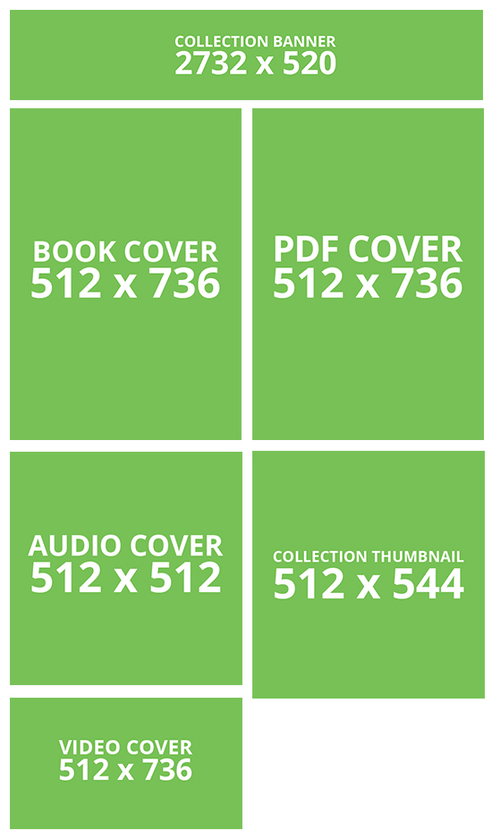
TO DOWNLOAD: Click the image below to begin downloading a ZIP file containing PSD, PNG, and JPG templates of the Content Creator image assets. These are basic templates that give you the image size for the various Creator elements and may start as building blocks for your content assets.
You may create in any style fitting your content in the graphics program of your choice.
Click
imageImage to
download:Download
Examples
:Collection Thumbnail
:
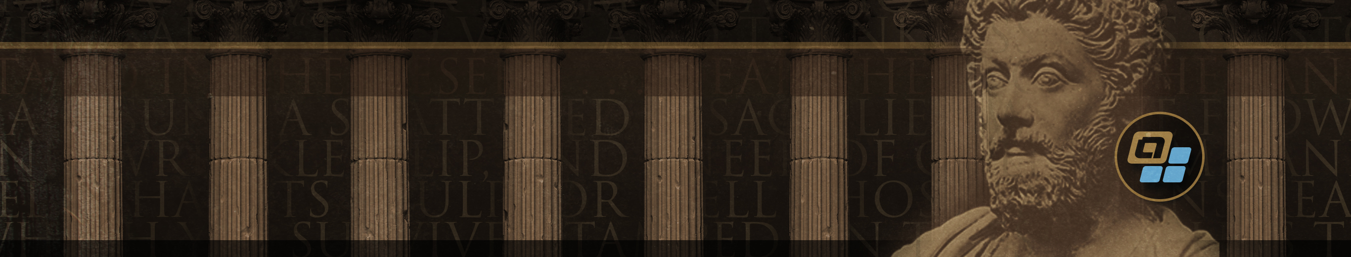
Collection Banner
:
| Info | |
|---|---|
Note: | The Collection Banner text is filled in programmatically, so it's best to think of it as a background element that visually supports your content. |
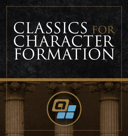
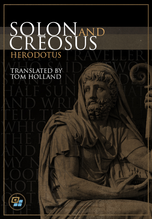
Book Cover Examples
:


| Page Tree | ||||
|---|---|---|---|---|
|
| Info | ||
|---|---|---|
| ||
Suggestion: Remember to design with mobile devices in mind—choose images and fonts that will scale well and read at small sizes. |
Splash Screens and Icons
:Splash Screens and Icons will adhere to Android and iOS standards and should be designed accordingly.
Here are the pertinent sizes and links to further information.
iOS Splash Screens
:Device | Portrait size | Landscape size |
|---|---|---|
12.9" iPad Pro | 2048px × 2732px | 2732px × 2048px |
11" iPad Pro | 1668px × 2388px | 2388px × 1668px |
10.5" iPad Pro | 1668px × 2224px | 2224px × 1668px |
9.7" iPad | 1536px × 2048px | 2048px × 1536px |
7.9" iPad mini 4 | 1536px × 2048px | 2048px × 1536px |
iPhone |
XS Max | 1242px × 2688px | 2688px × 1242px |
iPhone |
XS | 1125px × 2436px | 2436px × 1125px |
iPhone |
XR | 828px × 1792px | 1792px × 828px |
iPhone X | 1125px × 2436px | 2436px × 1125px |
iPhone 8 Plus | 1242px × 2208px | 2208px × 1242px |
iPhone 8 | 750px × 1334px | 1334px × 750px |
iPhone 7 Plus | 1242px × 2208px | 2208px × 1242px |
iPhone 7 | 750px × 1334px | 1334px × 750px |
iPhone 6s Plus | 1242px × 2208px | 2208px × 1242px |
iPhone 6s | 750px × 1334px | 1334px × 750px |
iPhone SE | 640px × 1136px | 1136px × 640px |
For further information:
iOS:
https://developer.apple.com/design/human-interface-guidelines/ios/icons-and-images/launch-screen/
| Info | ||
|---|---|---|
| title | Suggestion | !: For iOS, use 2048px width for portrait, 2732px width for landscape (corresponds to the largest current device size which is the 12.9" iPad Pro). Your image will be scaled down on smaller devices. Height can be whatever you desire. |
Splash
Android Splash Screens:
Drawable | Portrait size | Landscape size |
|---|---|---|
MDPI: | 320px x 480px |
|
480px x 320px | |
HDPI: |
|
480px x 800px |
|
800px x 480px | |
XHDPI: |
|
720px x 1280px |
|
1280px x 720px | |
XXHDPI: |
|
960px x 1600px |
|
1600px x 960px | |
XXXHDPI: |
|
1280px x 1920px |
|
1920px x 1280px |
Icons
:As there are a number of ways to create icons for iOS and Android, we suggest simply going with the iOS maximum size of 1024x1024 and creating your subsequent icons within the tool of your choice for both iOS and Android.
For further information:
iOS:
https://developer.apple.com/design/human-interface-guidelines/ios/icons-and-images/app-icon/
Android:
https://developer.android.com/guide/practices/ui_guidelines/icon_design